

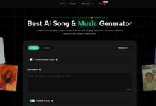
There is a strange paradox in creative work: too much freedom can slow people down just as much as too little freedom. Many AI tools promise boundless possibility, but boundless possibility is not always useful when the real job is narrow and immediate. That is why Image to Video AI became more interesting to me when I stopped thinking of it as a pure generation tool and started thinking of it as a creative constraint tool. It begins with a fixed image, asks for a prompt, and narrows the challenge to one key question: what kind of movement should this specific visual carry?
That constraint is not a weakness. In many workflows, it is a gift. A fixed image already gives the user boundaries. The composition is chosen. The subject is chosen. The palette is chosen. The emotional temperature is already visible. Once those decisions are locked, the platform’s role becomes more focused. It does not have to invent the entire creative universe. It only has to interpret motion, emphasis, and presentation.
I find this especially valuable because many creators do not struggle with imagination. They struggle with finishing. They can choose an image, but they hesitate when the next step requires a full editing process or a larger production environment. A tool that limits the task to image-plus-motion can reduce that hesitation.
By the time you look at the page from that perspective, Photo to Video starts to feel less like a novelty generator and more like a decision aid. It helps users commit to a direction because the creative problem has been narrowed to something manageable: preserve the image, add motion, and make the result publishable.
Why Constraint Can Improve Creative Output
People often assume better tools are the ones with more possibilities. In practice, some of the most useful tools are the ones that reduce the number of decisions required to get to a credible result.
A fixed image removes many early-stage choices
Starting with a still image eliminates dozens of questions that normally consume creative time. There is no need to choose an initial frame from scratch. No need to establish the core visual hierarchy. No need to guess the subject relationship. The image already contains those answers.
That changes what the user must decide. Instead of asking what the scene is, the user asks how the scene should move.
The landing page supports a narrow but real workflow
The public page reinforces this constraint-based logic. The visible controls focus on practical variables like aspect ratio, video length, resolution, frame rate, seed, and public visibility. The process itself remains compact: upload the image, enter a prompt, wait for processing, then review and share the result.
Narrow scope can increase confidence
A narrow workflow is easier to repeat. When users understand the limits of a tool, they often trust it more. In my observation, this page benefits from that clarity. It does not try to disguise its purpose. It is here to turn images into videos through a guided, web-based process.
How The Official Flow Shapes Creative Behavior
The visible structure of the page influences how a user thinks.

Step 1: Begin from a chosen image
The page accepts common formats like JPG, JPEG, PNG, and WebP. That means the creative act begins with selection. Before a prompt is written, the user is already making a meaningful editorial choice by choosing the starting image.
Step 2: Translate visual intention into language
The prompt stage is where interpretation enters. The user must think about what kind of motion the image can support. Should it feel calm, dramatic, cinematic, intimate, promotional, or playful? This is not only technical input. It is creative direction in compressed form.
Step 3: Let the system process the motion
The public page makes room for a real processing step, which is important because it sets expectations properly. The user is reminded that interpretation takes time and that generation is part of a workflow, not a magic reveal.
Step 4: Review, decide, and export
The final stage is not just download. It is judgment. Is the result aligned with the image? Did the motion help or distract? Does it feel right for the intended destination? This review step is where constraint becomes useful, because the user is evaluating against a fixed original rather than against infinite possibility.
What I Learned From This Testing Frame
Evaluating the page as a constraint tool led me to notice different strengths than I would have seen in a more general AI review.
The platform encourages directional thinking
Because the source image is already fixed, the user becomes more deliberate about movement. Instead of writing sprawling prompts about entire worlds, they are nudged to think about camera behavior, subject emphasis, mood, and pacing. That often leads to more disciplined creative choices.
The interface avoids performative complexity
One thing I appreciated is that the visible page does not act like complexity itself is a sign of power. It gives enough settings to feel meaningful, but it does not bury the user under a mountain of options. That creates a surprisingly focused creative atmosphere.
The output logic seems tied to actual use
The page and broader site repeatedly connect the workflow to social media, product showcases, educational material, memories, and business use. This matters because it helps the user evaluate the output against a real communication purpose rather than against abstract technical perfection.
Useful motion is more important than dramatic motion
This may be the core lesson of the test. The best result is not always the one with the most obvious movement. Sometimes the most effective output is the one that respects the still image and adds just enough animation to create attention without visual confusion.
Where The Page Feels Thoughtful
Some product pages are technically impressive but psychologically noisy. This one feels more deliberate.
It recognizes that users need boundaries
A fixed image plus a prompt is a strong structure. It gives freedom, but not so much freedom that the user becomes lost. In creative software, the right boundary can accelerate action.
It quietly teaches a workflow
Without sounding instructional in a heavy way, the page teaches the user how to think: choose the image, describe the motion, wait for processing, review the result. This is a very different mental model from traditional editing, and the page communicates it well.
See also: Understanding Employee Tracking Technology
It acknowledges multiple publishing destinations
The aspect ratio choices matter again here. They imply that the same image may be interpreted differently depending on where the result will live. A vertical short for social media and a wide promo clip do not ask the same thing from motion. The page gives users a way to think in those terms early.
The Honest Weaknesses Of This Approach
Creative constraints help, but they also impose their own limits.
The source image can dominate the result
Because the whole process is anchored to one image, the quality and clarity of that image matter a lot. If the original visual is weak, the motion may only amplify the weakness.

Some users may outgrow the page
A creator who wants layered storytelling, complex sequences, voice timing, or advanced post-production will eventually need more than a simple image-to-video interface. That is not a flaw. It is just the natural edge of the format.
Constraint does not remove the need for taste
A narrower workflow can make decisions easier, but it cannot make them for the user. Someone still has to judge whether the motion is appropriate, whether the output feels elegant, and whether the clip supports the intended message.
Why This Made The Page More Convincing
In a strange way, the page became more persuasive once I stopped asking it to be limitless. Limitless tools often feel impressive in theory and vague in practice. Constrained tools can feel less glamorous but more usable.
That is what this landing page communicates well. It gives the user a bounded creative problem and a bounded creative process. Upload the image. Describe the motion. Let the system interpret. Review the result. This is not a theory of all media. It is a focused production method.
For many users, that focus will be the reason the tool is opened at all. People are often more willing to experiment when the decision space is smaller and the starting asset is already in hand. Instead of needing to invent everything, they only need to shape what is already there.
So my test takeaway is this: the Photo to Video page works best when understood as a constraint-friendly creative utility. It does not ask the user to become a filmmaker. It asks them to become a better editor of motion possibilities around an image they already believe in. That is a modest promise, but in real workflows, modest promises are often the ones that get fulfilled.